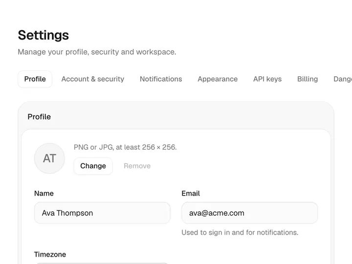
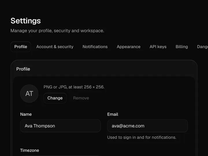
App Shell
ProInstallation
ProApp Shell is a Pro component
Sign in to see the source, or install it with a license key. The live preview and props above are free to explore.
Install with a key
- Add the Pro registry to
components.json:components.json { "registries": { "@uibrik-pro": { "url": "https://uibrik.com/r/pro/{name}.json", "headers": { "Authorization": "Bearer ${UIBRIK_LICENSE}" } } } } - Put your key in
.env.localand add that file to.gitignore:.env.local UIBRIK_LICENSE=your-license-key - Install it:
Terminal npx shadcn@latest add @uibrik-pro/app-shell
Loading your installation…
Props
AppShell- defaultCollapsed
- Type boolean
- false
- Start with the sidebar folded to an icon rail.
- nav
- Type { id: string; label?: string; items: { id: string; label: string; icon?: Icon; count?: number; href?: string }[] }[]
- –
- Nav groups, top to bottom.
- active
- Type string
- –
- Id of the current nav item. Uncontrolled when left out.
- onNavigate
- Type (id: string) => void
- –
- Called when a nav item is chosen.
- workspaces
- Type { id: string; name: string; plan?: string; logo?: string }[]
- –
- Workspaces in the switcher.
- workspace
- Type string
- –
- Id of the current workspace. Uncontrolled when left out.
- onWorkspaceChange
- Type (id: string) => void
- –
- Called when another workspace is picked.
- user
- Type { name: string; email: string; avatar?: string }
- –
- The signed-in person, shown at the foot.
- onUserAction
- Type (action: "profile" | "settings" | "signout") => void
- –
- Called from the account menu.
- onSearch
- Type () => void
- –
- Replaces the built-in search palette (button and ⌘K).
- padded
- Type boolean
- true
- Page padding around children. Turn off for pages that bring their own.
- breadcrumbs
- Type { label: string; href?: string }[]
- –
- Trail in the top bar. Defaults to workspace › current item.
- actions
- Type ReactNode
- –
- Right of the top bar. One primary action at most.
- collapsed
- Type boolean
- –
- Controlled rail state, with onCollapsedChange.
- children
- Type ReactNode
- –
- The page.
- className
- Type string
- –
- Classes for the root, which is the @container.