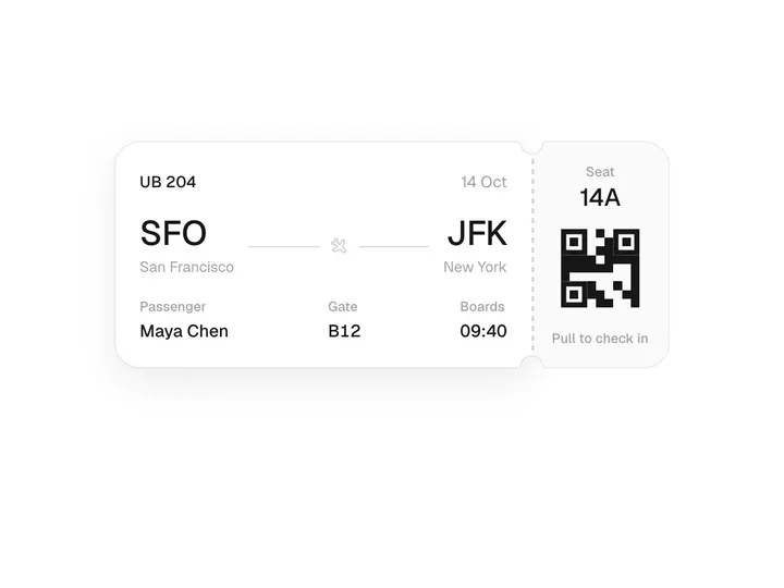
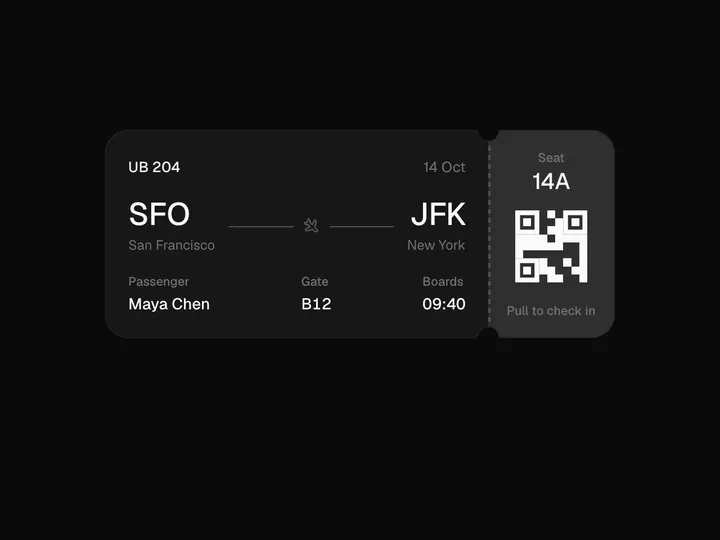
Marquee
NewInstallation
npx shadcn@latest add https://uibrik.com/r/marquee.jsonInstall the packages
npm install motion react-use-measureAdd the cn helper
Imports
cnfrom@/lib/utils, whichshadcn initcreates. Add it by hand without shadcn.Copy the source into your project
components/uibrik/marquee/marquee.tsx"use client"; // An endless row (or column) of anything: logos, quotes, tags. The content is // repeated just enough times to cover the frame, then the whole track slides // one copy's length and wraps, so the loop never shows a seam. Hovering can // ease it slower or to a stop (never a dead halt), it can be dragged and // flicked, and it rests while off screen or while focus is inside it. import { motion, useAnimationFrame, useMotionValue, useReducedMotion, useTransform, } from "motion/react"; import { useEffect, useRef, type PointerEvent, type ReactNode } from "react"; import useMeasure from "react-use-measure"; import { cn } from "@/lib/utils"; export type MarqueeProps = { children: ReactNode; /** Which way the content travels. Up and down need a frame with a height. */ direction?: "left" | "right" | "up" | "down"; /** Pixels per second. */
Adds the files to
components/uibrik/marquee and installs motion and react-use-measure. With the @uibrik namespace set up: npx shadcn@latest add @uibrik/marquee.Props
Marquee- direction
- Type "left" | "right" | "up" | "down"
- "left"
- Which way the content travels. Up and down need a frame with a height.
- speed
- Type number
- 40
- Pixels per second.
- onHover
- Type "slow" | "pause" | "none"
- "slow"
- Ease to a slower speed, ease to a stop, or ignore the pointer.
- hoverSpeed
- Type number
- 0.25
- Speed while hovered, as a share of speed.
- draggable
- Type boolean
- false
- Drag the track and flick it; it drifts back to its own speed.
- gap
- Type number
- 40
- Space between items.
- fadeEdges
- Type "both" | "start" | "end" | "none"
- "both"
- Which edges fade into the page. Start is left (or top when vertical).
- fade
- Type number
- 64
- Width of each faded edge.
- childrenrequired
- Type ReactNode
- –
- The items. They are repeated to fill the frame.
- className
- Type string
- –
- Classes for the frame.