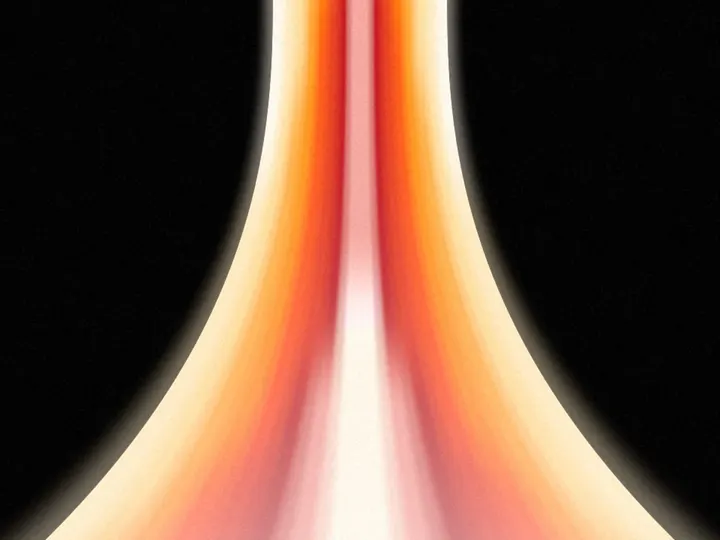
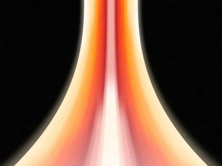
Horizon Gradient
NewCustomize
Color
top
Curve1.00
Reach1.00
Softness1.10
Speed1.0
Grain0.100
Installation
npx shadcn@latest add https://uibrik.com/r/horizon-gradient.jsonAdd the cn helper
Imports
cnfrom@/lib/utils, whichshadcn initcreates. Add it by hand without shadcn.Copy the source into your project
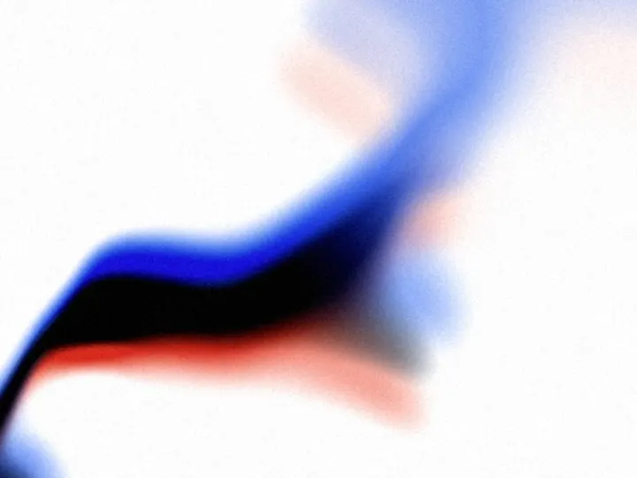
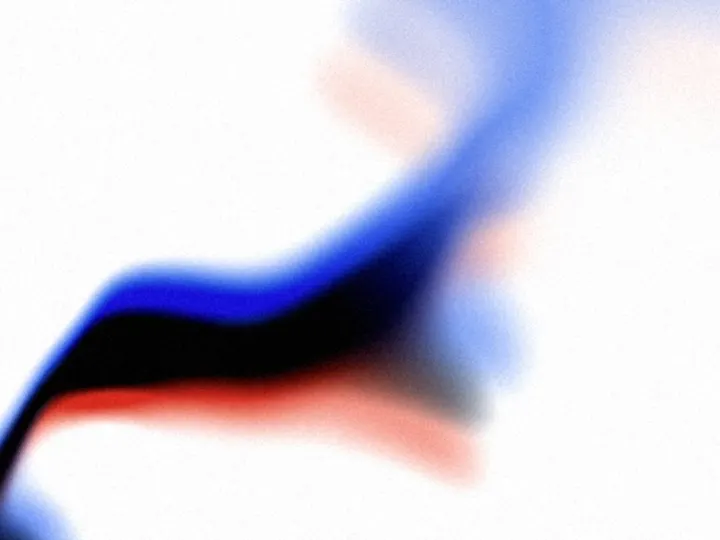
components/uibrik/horizon-gradient/horizon-gradient.tsx"use client"; import type { CSSProperties, ReactNode } from "react"; import { ShaderSurface, hexToOklab } from "../_shader-background/ShaderSurface"; // Night falling over a bright horizon: black at one edge (the top by default), deepening through // indigo and blue to white at the other. The colour follows the distance from a point past that edge, measured on a wide // ellipse, so every band arches like the edge of a planet: the dark dips lowest in the middle and // the blue rises up the sides. The point drifts and a slow, broad noise breathes through the // bands, so it moves without ever looking like it moves. On first showing the dark falls from // its edge into place over the light, the arch easing up as it comes. const SHADER = /* glsl */ ` uniform float u_curve; // how strongly the bands arch uniform float u_reach; // how far down the dark reaches uniform float u_softness; // how gradual the bands are uniform float u_direction; // edge the dark comes from: 0 top, 1 right, 2 bottom, 3 left // palette as a smooth curve through the stops (Catmull-Rom, in OKLab). Easing into each stop, as // the shared ramp does, leaves a plateau at every colour; straight blends leave a crease instead, // where the rate of change jumps, and the eye reads both as stripes in a gradient this large. A // curve keeps the rate of change continuous, so the bands melt into each other. The ends repeat, // so the curve settles gently into the darkest and lightest colours. vec3 stop(int i) { return u_colors[clamp(i, 0, u_count - 1)];
Adds the files to
components/uibrik/horizon-gradient. With the @uibrik namespace set up: npx shadcn@latest add @uibrik/horizon-gradient.Usage
import { HorizonGradient } from "@/components/uibrik/horizon-gradient/horizon-gradient";<HorizonGradient color="#2b35d6" direction="top" curve={1} reach={1} softness={1.1} speed={1} grain={0.1}> …</HorizonGradient>Props
HorizonGradient- color
- Type string
- "#2b35d6"
- Colour of the sky between the dark and the light; drawn in shades of it.
- colors
- Type string[]
- ["#000000","#2a0b4f","#7b2fd1","#f06aa8","#ffd2b8","#fffaf5"]
- Hex colours, 2 to 6, from the dark edge to the light one. Overrides color.
- direction
- Type "top" | "right" | "bottom" | "left"
- "top"
- Edge the dark comes from; the light gathers at the opposite one.
- curve
- Type number
- 1
- How strongly the bands arch; 0 is nearly level.
- reach
- Type number
- 1
- How far down the dark reaches; 1 is the designed height.
- softness
- Type number
- 1.1
- How gradual the bands are; higher spreads them over more of the frame.
- speed
- Type number
- 1
- Animation speed; 1 is the designed pace.
- grain
- Type number
- 0.1
- Film grain strength.
- children
- Type ReactNode
- –
- Content shown on top of the background.
- className
- Type string
- –
- Classes for the box; it fills whatever size you give it.