Liquid Progress
NewCustomize
Color
Height12px
Installation
npx shadcn@latest add https://uibrik.com/r/liquid-progress.jsonInstall the packages
npm install @number-flow/react @tabler/icons-react motionAdd the cn helper
Imports
cnfrom@/lib/utils, whichshadcn initcreates. Add it by hand without shadcn.Copy the source into your project
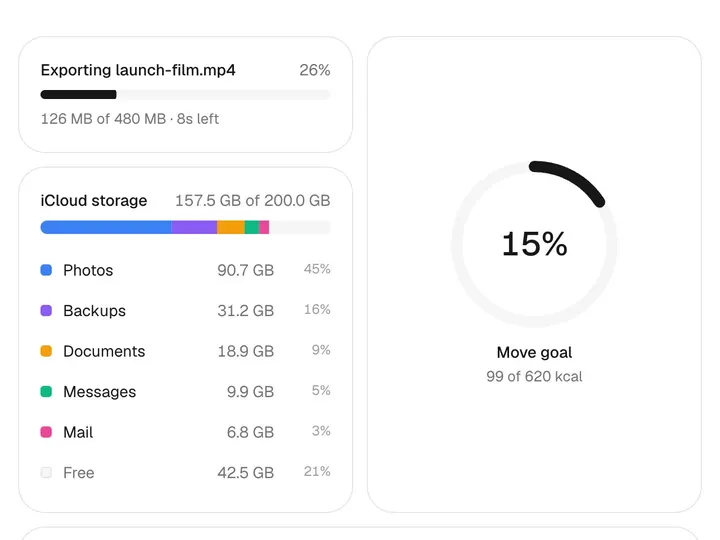
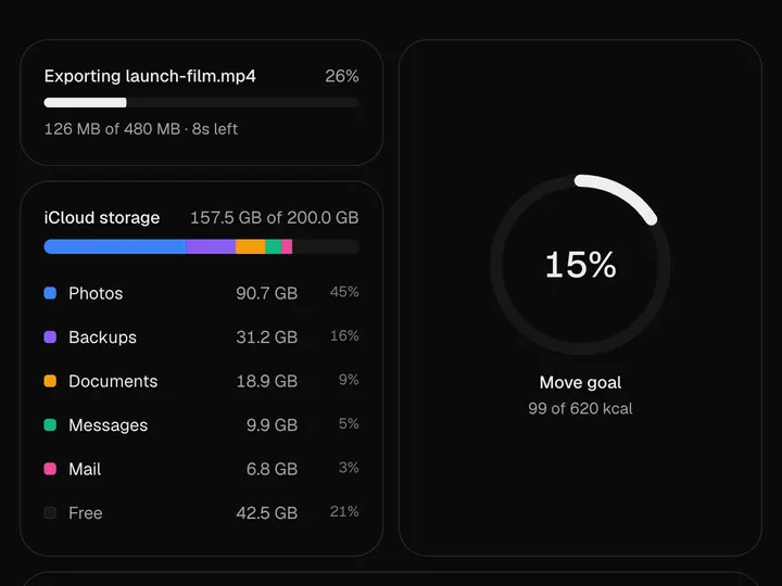
components/uibrik/liquid-progress/liquid-progress.tsx"use client"; import { useEffect, useMemo, useState, type ReactNode } from "react"; import { motion, useMotionValueEvent, useReducedMotion, useSpring, useTransform } from "motion/react"; import NumberFlow from "@number-flow/react"; import { IconCircleCheckFilled } from "@tabler/icons-react"; import { cn } from "@/lib/utils"; // A plain progress bar with a liquid feel. The fill is a run of tones of one // colour pinned to the track, so it brightens as it reaches further; a soft // shine along its top reads as a rounded surface, and the front eases in on a // spring that only just overshoots, so it settles with a small wobble when // progress pauses. Only clip-path moves, so nothing lays out while it runs. // When the fill reaches the end, the label turns into a completed status with // a check, and one pass of light runs along the bar to mark the moment. const EASE_OUT = [0.23, 1, 0.32, 1] as const; export type LiquidProgressProps = { /** Progress from 0 to 100. */ value: number; /** Names what's loading. Also the progress bar's accessible name. */ label?: string; /** Status shown with a check once the fill reaches the end. */
Adds the files to
components/uibrik/liquid-progress and installs @number-flow/react, @tabler/icons-react and motion. With the @uibrik namespace set up: npx shadcn@latest add @uibrik/liquid-progress.Usage
import { LiquidProgress } from "@/components/uibrik/liquid-progress/liquid-progress";<LiquidProgress value={0} label="Uploading" doneLabel="Completed" color="#16a34a" height={12} showValue onComplete={() => {}}/>Props
LiquidProgress- label
- Type string
- "Uploading"
- Names what's loading; also the accessible name.
- doneLabel
- Type string
- "Completed"
- Status shown with a check once the fill reaches the end.
- color
- Type string
- "#16a34a"
- Colour of the fill, drawn as a run of its tones.
- height
- Type number
- 12
- Height of the track.
- showValue
- Type boolean
- true
- Show the percentage beside the label.
- valuerequired
- Type number
- –
- Progress from 0 to 100.
- onComplete
- Type () => void
- –
- Called once when the fill reaches the end.
- className
- Type string
- –
- Classes for the outer wrapper.