Updated
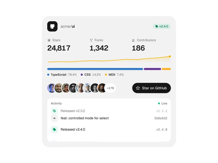
Contributor Grid
ProCustomize
Total186
Faces0
Weeks26
Size44px
Gap10px
Circle
Accent
Open delay120ms
Installation
ProContributor Grid is a Pro component
Sign in to see the source, or install it with a license key. The live preview and props above are free to explore.
Install with a key
- Add the Pro registry to
components.json:components.json { "registries": { "@uibrik-pro": { "url": "https://uibrik.com/r/pro/{name}.json", "headers": { "Authorization": "Bearer ${UIBRIK_LICENSE}" } } } } - Put your key in
.env.localand add that file to.gitignore:.env.local UIBRIK_LICENSE=your-license-key - Install it:
Terminal npx shadcn@latest add @uibrik-pro/contributor-grid
Loading your installation…
Usage
import { ContributorGrid } from "@/components/uibrik/contributor-grid/contributor-grid";<ContributorGrid title="Contributors" contributorCount={186} max={0} weeks={26} size={44} gap={10} shape="circle" accent="#16a34a" dim openDelay={120} moreHref="#" locale="en-US" defaultActive={null} onActiveChange={(id) => {}} // contributors={[{ name: "…", commits: 0 }]} // active="…"/>Where to use Contributor Grid
Open source homepages
Every contributor's face in one grid, with their commits a hover away, shows a project is more than one maintainer.
Pairs with Open Source
Team activity pages
A heat strip of recent weeks per person makes who is shipping right now easy to read at a glance.
Community credits
A +N tile links to the full list, so a page can thank hundreds of people without a wall of names.
Pairs with Avatar Stack
Props
ContributorGrid- title
- Type string
- "Contributors"
- Heading above the grid. Empty hides the heading row.
- contributorCount
- Type number
- 186
- Total contributors, shown by the heading; faces beyond the grid are counted in a +N tile.
- max
- Type number
- 0
- Most faces in the grid. 0 shows everyone given.
- weeks
- Type number
- 26
- Weeks of activity in the heat strip.
- size
- Type number
- 44
- Face size. Keep it at 40 or more for touch.
- gap
- Type number
- 10
- Space between faces.
- shape
- Type "circle" | "rounded"
- "circle"
- Shape of the faces.
- accent
- Type string
- "#16a34a"
- Colour of the heat strip and the focus ring.
- dim
- Type boolean
- true
- Dim the other faces while one is open.
- openDelay
- Type number
- 120
- Wait before the first card opens on hover. Moving between faces after that is instant.
- contributors
- Type { id?: string; name: string; handle?: string; src?: string; commits: number; activity?: number[]; href?: string }[]
- SAMPLE_CONTRIBUTORS
- Faces in order. activity is commits per week, oldest first. Initials stand in when there is no photo, and href turns the name in the card into a link.
- moreHref
- Type string
- –
- Link for the +N tile, e.g. your full contributors page.
- locale
- Type string
- "en-US"
- Locale for number formatting.
- active / defaultActive
- Type string | null
- null
- Id of the open card, controlled or uncontrolled. Ids default to the handle, then the name.
- onActiveChange
- Type (id: string | null) => void
- –
- Called when a card opens or closes.
- className
- Type string
- –
- Classes for the wrapper.