Updated
Lens Carousel
ProCustomize
Slide width280px
Ratio1.25
Gap14px
Rounding20px
Edge24%
Pull70
Magnify80%
Flare22%
Blur14px
Shift10px
Interval3.5s
Installation
ProLens Carousel is a Pro component
Sign in to see the source, or install it with a license key. The live preview and props above are free to explore.
Install with a key
- Add the Pro registry to
components.json:components.json { "registries": { "@uibrik-pro": { "url": "https://uibrik.com/r/pro/{name}.json", "headers": { "Authorization": "Bearer ${UIBRIK_LICENSE}" } } } } - Put your key in
.env.localand add that file to.gitignore:.env.local UIBRIK_LICENSE=your-license-key - Install it:
Terminal npx shadcn@latest add @uibrik-pro/lens-carousel
Loading your installation…
Usage
import { LensCarousel } from "@/components/uibrik/lens-carousel/lens-carousel";const slides = [ { src: "/registry/lens-carousel/lotus-centre.webp", alt: "Golden centre of a pink lotus" }, { src: "/registry/lens-carousel/dahlia.webp", alt: "Cream dahlia with violet-tipped petals" }, // …6 more];<LensCarousel slideWidth={280} ratio={1.25} gap={14} rounding={20} edge={24} pull={70} magnify={80} flare={22} blur={14} shift={10} autoplay interval={3.5} controls slides={slides} defaultIndex={0} label="Gallery" // index={0} // onIndexChange={(index) => {}}/>Where to use Lens Carousel
Product galleries
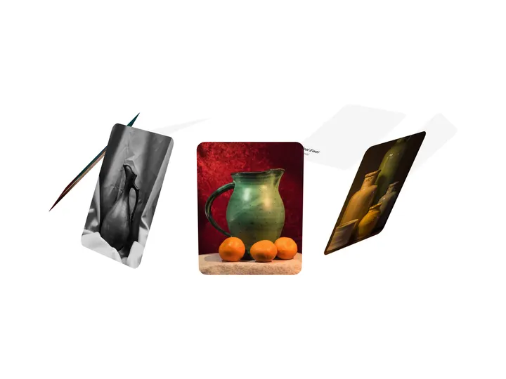
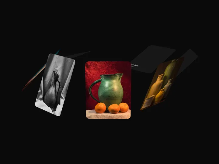
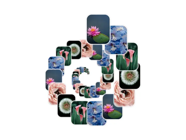
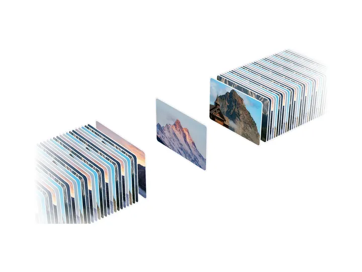
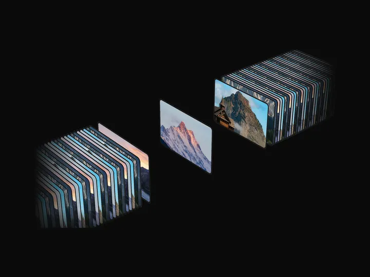
Slides pulled toward the rim like thick glass make a carousel feel physical.
Pairs with Curved Gallery
Glass hero carousels
Colour splitting at the edges echoes Apple-style glass.
Pairs with Liquid Glass Lens
Campaign showcases
Drawing pauses while the carousel is still, so the WebGL effect costs nothing while visitors read.
Props
LensCarousel- slideWidth
- Type number
- 280
- Smallest slide width. Slides grow past it on wide screens so exactly three show at a time.
- ratio
- Type number
- 1.25
- Slide height against its width.
- gap
- Type number
- 14
- Space between slides.
- rounding
- Type number
- 20
- Corner radius of a slide.
- edge
- Type number
- 24
- Share of the width, per side, that acts as the lens.
- pull
- Type number
- 70
- How hard the lens pulls slides towards the rim. Above 50 the outer part folds back mirrored.
- magnify
- Type number
- 80
- How much taller a slide's picture swells at the rim.
- flare
- Type number
- 22
- How far a slide's top and bottom edges sweep out at the rim, like the flanks of a hill.
- blur
- Type number
- 14
- Sideways smear at the rim.
- shift
- Type number
- 10
- How far red and blue split apart at the rim.
- autoplay
- Type boolean
- true
- Move on by itself. Holds on hover, focus and drag.
- interval
- Type number
- 3.5
- Time between slides when autoplaying.
- controls
- Type boolean
- true
- Previous and next buttons under the carousel.
- slides
- Type { src: string; alt: string }[]
- 8 sample photos
- The slides, in order, up to 32. Photos on another origin need CORS headers to reach the GPU.
- index / onIndexChange
- Type number / (index) => void
- –
- Controlled current slide, from 0.
- defaultIndex
- Type number
- 0
- Slide on mount when uncontrolled.
- label
- Type string
- "Gallery"
- Names the carousel for screen readers.
- className
- Type string
- –
- Classes for the wrapper. It fills its container's width.