Updated
Swipe Rows
ProCustomize
Threshold0.55
Inset
Radius24px
Installation
ProSwipe Rows is a Pro component
Sign in to see the source, or install it with a license key. The live preview and props above are free to explore.
Install with a key
- Add the Pro registry to
components.json:components.json { "registries": { "@uibrik-pro": { "url": "https://uibrik.com/r/pro/{name}.json", "headers": { "Authorization": "Bearer ${UIBRIK_LICENSE}" } } } } - Put your key in
.env.localand add that file to.gitignore:.env.local UIBRIK_LICENSE=your-license-key - Install it:
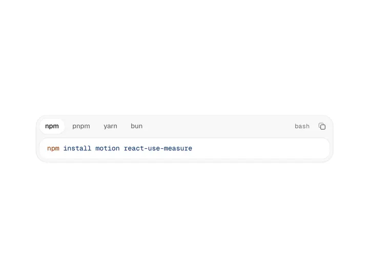
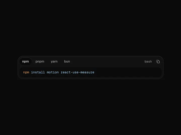
Terminal npx shadcn@latest add @uibrik-pro/swipe-rows
Loading your installation…
Usage
import { SwipeRows } from "@/components/uibrik/swipe-rows/swipe-rows";const items = [ { id: "1", title: "Maya Chen", meta: "9:41", subtitle: "Final cut for Thursday", description: "Trimmed the intro to eight seconds and swapped the closing shot. Have a look before I export the masters.", unread: true, }, { id: "2", title: "Jonas Weber", meta: "8:12", subtitle: "Lisbon, flights confirmed", description: "Out on the 14th at 07:05, back on the 19th. Seats are together, the hotel is a short walk from the river.", unread: true, }, // …3 more];<SwipeRows items={items} fullSwipe threshold={0.55} haptics hoverActions variant="inset" radius={24} onAction={(actionId, item) => {}} onSelect={(item) => {}} // leadingActions={[[…]]} // trailingActions={[[…]]} // renderItem={(item) => {}} // openId="…" // onOpenChange={(id) => {}}/>Props
SwipeRows- fullSwipe
- Type boolean
- true
- Swiping far enough runs the edge action without lifting to tap it.
- threshold
- Type number
- 0.55
- Share of the row's width a swipe must pass to arm the full swipe.
- haptics
- Type boolean
- true
- A short vibration when a full swipe arms, on devices that support it.
- hoverActions
- Type boolean
- true
- Small action buttons on hover and keyboard focus.
- variant
- Type "inset" | "plain"
- "inset"
- Inset is a rounded group; Plain runs edge to edge.
- radius
- Type number
- 24
- Corner radius of the inset group.
- itemsrequired
- Type { id: string; title: string; meta?: string; subtitle?: string; description?: string; avatar?: ReactNode; unread?: boolean; flagged?: boolean }[]
- –
- Rows, in order. Remove an item to collapse its row.
- leadingActions / trailingActions
- Type SwipeAction[] | (item) => SwipeAction[]
- –
- Actions revealed by swiping right / left. Each is { id, label, icon, color?, destructive? }. The first sits at the edge and runs on a full swipe. Pass a function to vary them per row.
- onAction
- Type (actionId, item) => void
- –
- Runs after a destructive action's row has slid away, or at once for the others.
- onSelect
- Type (item) => void
- –
- Tap or Enter on a closed row.
- renderItem
- Type (item) => ReactNode
- –
- Custom row content in place of the built-in layout.
- openId / onOpenChange
- Type string | null / (id) => void
- –
- Controlled open row. Only one row is open at a time.
- className
- Type string
- –
- Classes for the list.