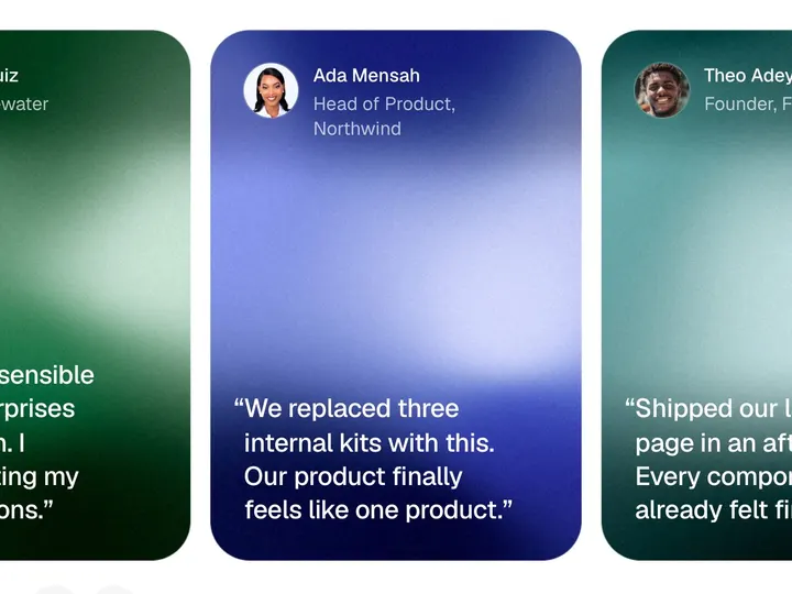
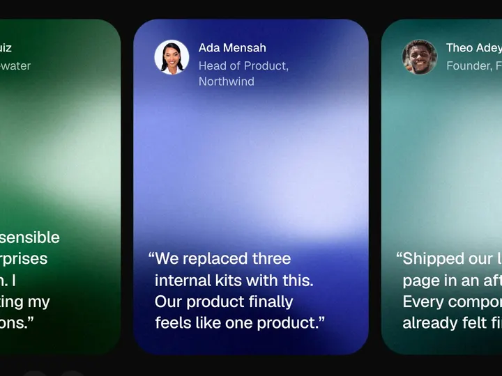
Testimonial Bubbles
ProCustomize
Interval3500ms
Height520px
Min size48px
Max size96px
Gap10px
Card width380px
Card radius32px
Magnify0.35
Installation
ProTestimonial Bubbles is a Pro component
Sign in to see the source, or install it with a license key. The live preview and props above are free to explore.
Install with a key
- Add the Pro registry to
components.json:components.json { "registries": { "@uibrik-pro": { "url": "https://uibrik.com/r/pro/{name}.json", "headers": { "Authorization": "Bearer ${UIBRIK_LICENSE}" } } } } - Put your key in
.env.localand add that file to.gitignore:.env.local UIBRIK_LICENSE=your-license-key - Install it:
Terminal npx shadcn@latest add @uibrik-pro/testimonial-bubbles
Loading your installation…
Usage
import { TestimonialBubbles } from "@/components/uibrik/testimonial-bubbles/testimonial-bubbles";<TestimonialBubbles autoplay interval={3500} height={520} minSize={48} maxSize={96} gap={10} cardWidth={380} cardRadius={32} float magnify={0.35} defaultValue={null} // items={[{ id: "…", name: "…", role: "…", message: "…", avatar: "…" }]} // value="…" // onChange={(id) => {}}/>Props
TestimonialBubbles- autoplay
- Type boolean
- true
- Step through the testimonials on its own. Holds while hovered or focused.
- interval
- Type number
- 3500
- Time each testimonial stays open with autoplay.
- height
- Type number
- 520
- Height of the area the bubbles float in.
- minSize
- Type number
- 48
- Smallest bubble. Shrinks a little on narrow screens.
- maxSize
- Type number
- 96
- Largest bubble. Shrinks a little on narrow screens.
- gap
- Type number
- 10
- Space kept between bubbles, and around the open card.
- cardWidth
- Type number
- 380
- Width of the open card.
- cardRadius
- Type number
- 32
- Corner radius of the open card.
- float
- Type boolean
- true
- Bubbles bob gently while idle.
- magnify
- Type number
- 0.35
- How much bubbles under the mouse swell. 0 turns it off.
- items
- Type { id: string; name: string; role: string; message: string; avatar: string }[]
- SAMPLE_TESTIMONIALS
- People in the cluster, with what they said.
- value / onChange
- Type string | null / (id) => void
- –
- Controlled open testimonial.
- defaultValue
- Type string | null
- null
- Testimonial open to begin with.
- className
- Type string
- –
- Classes for the wrapper.