Updated
Agent Island
ProCustomize
Width380px
Colors
Agents
Installation
ProAgent Island is a Pro component
Sign in to see the source, or install it with a license key. The live preview and props above are free to explore.
Install with a key
- Add the Pro registry to
components.json:components.json { "registries": { "@uibrik-pro": { "url": "https://uibrik.com/r/pro/{name}.json", "headers": { "Authorization": "Bearer ${UIBRIK_LICENSE}" } } } } - Put your key in
.env.localand add that file to.gitignore:.env.local UIBRIK_LICENSE=your-license-key - Install it:
Terminal npx shadcn@latest add @uibrik-pro/agent-island
Loading your installation…
Usage
import { AgentIsland } from "@/components/uibrik/agent-island/agent-island";const agents = [ { id: "plan", name: "Planner", status: "done", action: "Planned 3 tasks" }, { id: "build", name: "Builder", status: "running", action: "Editing hero.tsx", startedAt: Date.now() }, { id: "check", name: "Checker", status: "waiting", action: "Wants to run tests", request: "npm test" },];const colors = ["#5b7bd6", "#9a6fd8", "#2f9e83", "#c2579a", "#3e9bc4", "#7d8b3a"];<AgentIsland agents={agents} autoExpand pulse showBranch showUsage width={380} colors={colors} defaultView="agents" defaultOpen={false} views={["agents", "graph", "usage"]} warnAt={0.8} label="Agent session" // view={…} // onViewChange={(view) => {}} // branch={{ name: "…" }} // usage={{ tokens: 0, limit: 0 }} // onApprove={(agentId) => {}} // onDeny={(agentId) => {}} // open={false} // onOpenChange={(open) => {}}/>Props
AgentIsland- autoExpand
- Type boolean
- true
- Opens when an agent asks for permission, and folds back once it's answered.
- pulse
- Type boolean
- true
- A soft ping on working agents and a shimmer while they think.
- showBranch
- Type boolean
- true
- The git branch, commits ahead/behind and changed files in the card.
- showUsage
- Type boolean
- true
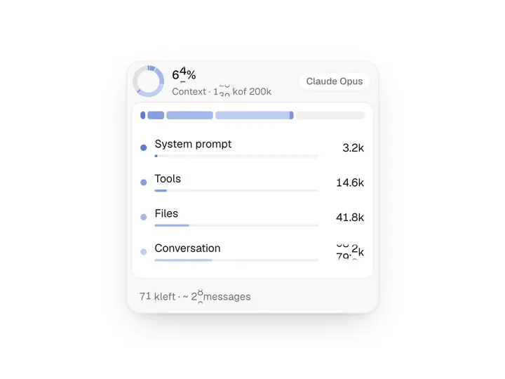
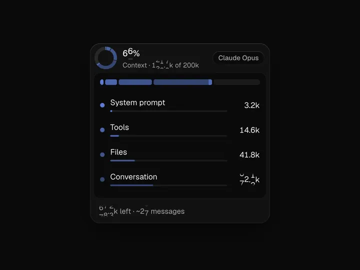
- Tokens, cost and a bar split by agent.
- width
- Type number
- 380
- Width of the open card. It shrinks to fit narrow containers.
- colors
- Type string[]
- ["#5b7bd6","#9a6fd8","#2f9e83","#c2579a","#3e9bc4","#7d8b3a"]
- Identity colours, given to agents in order. Shown only on dots and usage slices.
- defaultView
- Type "agents" | "graph" | "usage"
- "agents"
- Agents lists each agent; Graph draws them as branches over time; Usage shows token burn and each agent's share.
- defaultOpen
- Type boolean
- false
- Opens as the card on first render.
- agentsrequired
- Type { id: string; name: string; status: 'thinking' | 'running' | 'waiting' | 'done' | 'error'; action: string; startedAt?: number; finishedAt?: number; tokens?: number; additions?: number; deletions?: number; steps?: { id; label; tool?; done?; at? }[]; request?: string; color?: string; parentId?: string }[]
- –
- Agents in order. Add one to spawn its row and dot; change `action` and it rolls to the new text. A `waiting` agent shows its `request` with Approve and Deny. `parentId` forks its branch from that agent on the graph.
- views
- Type ('agents' | 'graph' | 'usage')[]
- ["agents", "graph", "usage"]
- Views in the card's switcher, in order. Pass one to hide the switcher.
- view / onViewChange
- Type AgentView / (view) => void
- –
- Controlled view.
- branch
- Type { name: string; ahead?: number; behind?: number; changes?: number }
- –
- Shown as a chip in the card's top row.
- usage
- Type { tokens: number; limit: number; cost?: number; currency?: string }
- –
- Fills the ring in the pill and the bar in the card.
- onApprove / onDeny
- Type (agentId: string) => void
- –
- Answers a waiting agent's request.
- open / onOpenChange
- Type boolean / (open: boolean) => void
- –
- Controlled open state.
- warnAt
- Type number
- 0.8
- Share of the usage limit where usage turns amber.
- label
- Type string
- "Agent session"
- Names the island for screen readers.
- className
- Type string
- –
- Classes for the outer box, which sets the space the island centres in.