Updated
Field Slider
ProCustomize
Start value40
Step1
Ticks41
Lean30°
Reach4.0
Colors
Installation
ProField Slider is a Pro component
Sign in to see the source, or install it with a license key. The live preview and props above are free to explore.
Install with a key
- Add the Pro registry to
components.json:components.json { "registries": { "@uibrik-pro": { "url": "https://uibrik.com/r/pro/{name}.json", "headers": { "Authorization": "Bearer ${UIBRIK_LICENSE}" } } } } - Put your key in
.env.localand add that file to.gitignore:.env.local UIBRIK_LICENSE=your-license-key - Install it:
Terminal npx shadcn@latest add @uibrik-pro/field-slider
Loading your installation…
Usage
import { FieldSlider } from "@/components/uibrik/field-slider/field-slider";<FieldSlider label="Volume" defaultValue={40} step={1} ticks={41} lean={30} reach={4} showValue colors={["#9cc7ff", "#2f6bff"]} disabled={false} min={0} max={100} onChange={(value) => {}} onCommit={(value) => {}} // value={0} // format={(value) => {}} // name="…"/>Where to use Field Slider
Volume and audio
The leaning ticks give a plain range input the feel of a physical control, with no extra chrome.
Pairs with Music Player and Elastic Slider
Settings panels
A tick row sits quietly in a dense list of options and only comes alive where the user is pointing.
Pairs with Settings Page and Segmented Control
Editors and filters
Intensity, opacity and blur controls read clearly as a scale, with the filled side showing the amount at a glance.
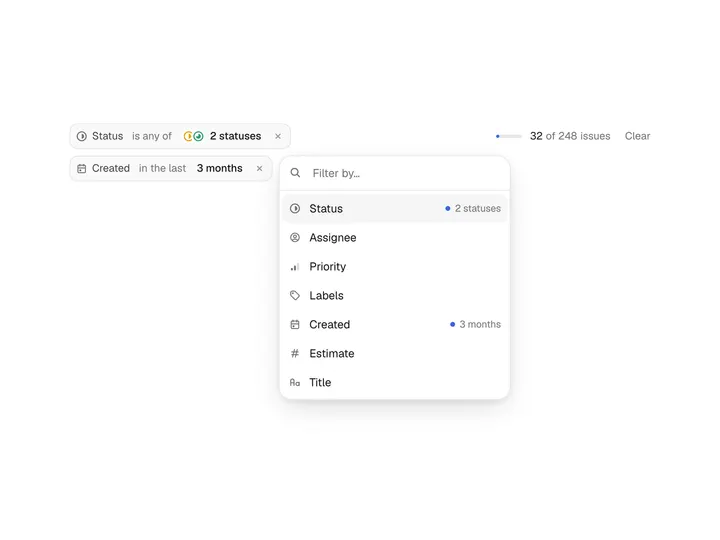
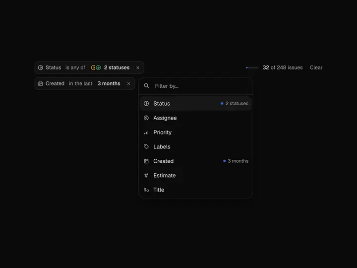
Pairs with Filter Bar
Props
FieldSlider- label
- Type string
- "Volume"
- Shown above the ticks and used as the accessible name.
- defaultValue
- Type number
- 40
- Starting value when uncontrolled.
- step
- Type number
- 1
- Value increment.
- ticks
- Type number
- 41
- Number of ticks across the row.
- lean
- Type number
- 30
- Strongest lean, for the ticks right beside the handle.
- reach
- Type number
- 4
- How far the pull reaches, in ticks.
- showValue
- Type boolean
- true
- Shows the value next to the label.
- colors
- Type string[]
- ["#9cc7ff","#2f6bff"]
- Gradient across the filled ticks, from the start to the handle. Shades of one colour by default.
- disabled
- Type boolean
- false
- value
- Type number
- –
- Controlled value.
- onChange
- Type (value: number) => void
- –
- Called as the value changes.
- onCommit
- Type (value: number) => void
- –
- Called once a drag or key press ends, with the final value.
- min
- Type number
- 0
- Lowest value.
- max
- Type number
- 100
- Highest value.
- format
- Type (value: number) => string
- –
- Formats the readout and the value read to screen readers, e.g. a percent or unit.
- name
- Type string
- –
- Form field name; adds a hidden input with the value.
- className
- Type string
- –
- Classes for the wrapper. It fills its container up to max-w-sm.