Updated
Particle Password
ProCustomize
Duration620ms
Spread16px
Stagger26ms
Color
Medium
Radius12px
Installation
ProParticle Password is a Pro component
Sign in to see the source, or install it with a license key. The live preview and props above are free to explore.
Install with a key
- Add the Pro registry to
components.json:components.json { "registries": { "@uibrik-pro": { "url": "https://uibrik.com/r/pro/{name}.json", "headers": { "Authorization": "Bearer ${UIBRIK_LICENSE}" } } } } - Put your key in
.env.localand add that file to.gitignore:.env.local UIBRIK_LICENSE=your-license-key - Install it:
Terminal npx shadcn@latest add @uibrik-pro/particle-password
Loading your installation…
Usage
import { ParticlePassword } from "@/components/uibrik/particle-password/particle-password";<ParticlePassword duration={620} spread={16} stagger={26} color="" size="md" radius={12} defaultValue="correct-horse-42" defaultVisible={false} placeholder="Password" label="Password" autoComplete="current-password" onChange={(value) => {}} onVisibleChange={(visible) => {}} // value="…" // visible={false} // name="…" // disabled={false}/>Where to use Particle Password
Sign-in and sign-up
Checking a typed password becomes a small moment instead of a flicker between dots and text.
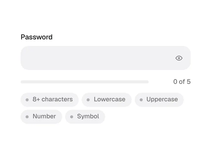
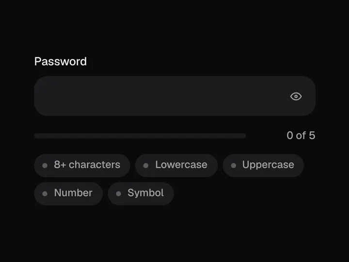
Pairs with Auth Forms and Password Strength
API keys and secrets
Revealing a stored key or token one character at a time makes it feel deliberate.
Pairs with Copy Button
Settings and billing
Card security codes and PINs can sit masked and burst into view on request.
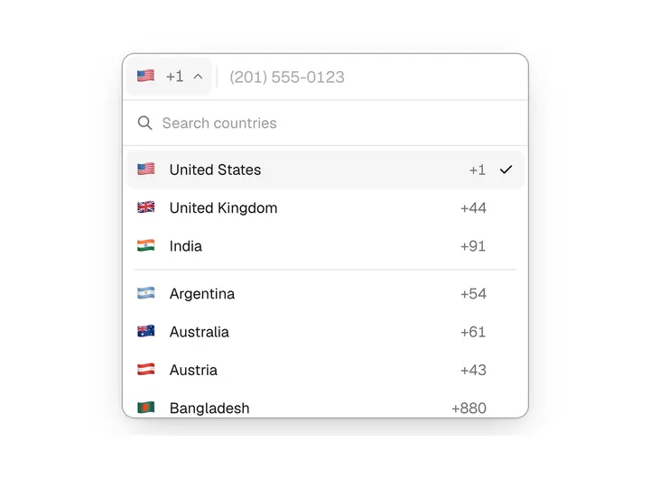
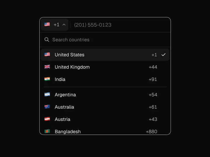
Pairs with Settings Page and Card Input
Props
ParticlePassword- duration
- Type number
- 620
- Length of one character's flight.
- spread
- Type number
- 16
- How far particles fly out before they gather.
- stagger
- Type number
- 26
- Delay between one character and the next.
- color
- Type string
- ""
- Particle colour mid-flight; empty keeps the text colour.
- size
- Type "sm" | "md" | "lg"
- "md"
- Height, padding and text size.
- radius
- Type number
- 12
- Corner radius.
- value
- Type string
- –
- Controlled value.
- defaultValue
- Type string
- ""
- Starting value when uncontrolled.
- onChange
- Type (value: string) => void
- –
- Called with the new value.
- visible
- Type boolean
- –
- Controlled: whether the password shows as text.
- defaultVisible
- Type boolean
- false
- Starting visibility when uncontrolled.
- onVisibleChange
- Type (visible: boolean) => void
- –
- Called when the eye button is pressed.
- placeholder
- Type string
- "Password"
- Placeholder text.
- label
- Type string
- "Password"
- Accessible name for the field.
- name
- Type string
- –
- Form field name.
- autoComplete
- Type string
- "current-password"
- Use "new-password" on sign-up forms.
- disabled
- Type boolean
- false
- Disables the field and the button.
- className
- Type string
- –
- Classes for the wrapper.