Updated
Milestone Timeline
ProCustomize
Left
Color
Anchor0.55
Installation
ProMilestone Timeline is a Pro component
Sign in to see the source, or install it with a license key. The live preview and props above are free to explore.
Install with a key
- Add the Pro registry to
components.json:components.json { "registries": { "@uibrik-pro": { "url": "https://uibrik.com/r/pro/{name}.json", "headers": { "Authorization": "Bearer ${UIBRIK_LICENSE}" } } } } - Put your key in
.env.localand add that file to.gitignore:.env.local UIBRIK_LICENSE=your-license-key - Install it:
Terminal npx shadcn@latest add @uibrik-pro/milestone-timeline
Loading your installation…
Usage
import { MilestoneTimeline } from "@/components/uibrik/milestone-timeline/milestone-timeline";const items = [ { date: "2018", title: "The first commit", description: "Two founders, a spare room and a prototype that ran on one laptop." }, { date: "2019", title: "Private beta", description: "Forty teams tried it for a month. Thirty-two stayed.", tag: "Beta" }, // …6 more];<MilestoneTimeline layout="left" color="" anchor={0.55} items={items} // scrollContainer={…}/>Where to use Milestone Timeline
About and company history pages
The line fills under the reader's scroll, so years of history read as one continuous story.
Pairs with Testimonial Wall
Product release history
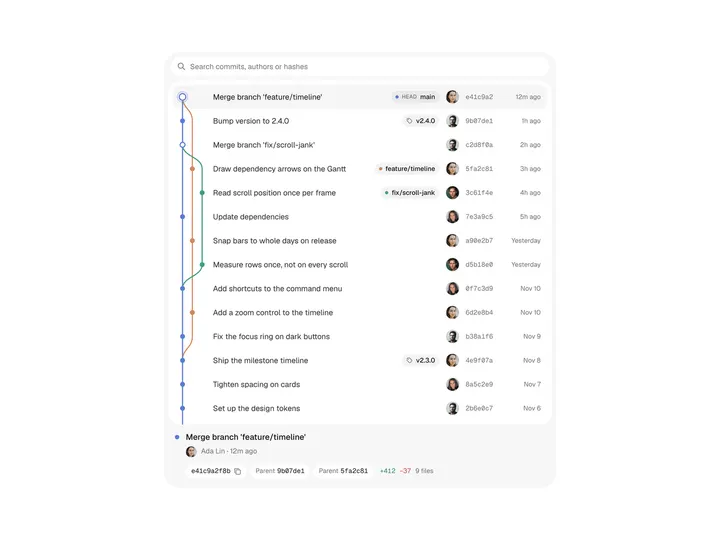
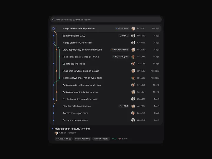
Versions light up in order with their launch tags as the reader scrolls past them.
Onboarding and case-study stories
Alternate layout zig-zags the steps across the spine for a lighter, editorial page.
Pairs with Scroll to Highlight
Props
MilestoneTimeline- layout
- Type "left" | "alternate"
- "left"
- Keep milestones on one side of the spine, or zig-zag them on wide containers.
- color
- Type string
- ""
- Fill and reached-dot colour. Empty uses the text colour.
- anchor
- Type number
- 0.55
- Where the fill's tip sits, as a fraction of the viewport height from the top.
- items
- Type { id?: string; date: string; title: string; description?: string; tag?: string; icon?: ReactNode }[]
- SAMPLE_MILESTONES
- Milestones, oldest first. `date` is shown as given, so "Q3 2024" works.
- scrollContainer
- Type RefObject<HTMLElement | null>
- –
- Scrolling element to follow when the timeline isn't scrolled by the window.
- className
- Type string
- –
- Classes for the section.