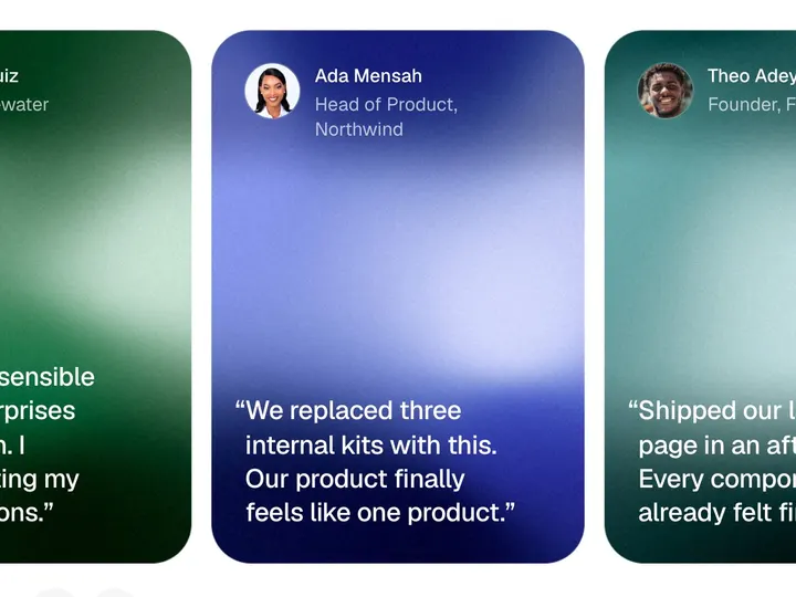
Testimonial Wall
NewCustomize
Vertical
Columns3
Speed24px/s
Pause
Height560px
Fade96px
Installation
npx shadcn@latest add https://uibrik.com/r/testimonial-wall.jsonInstall the packages
npm install motion react-use-measureAdd the cn helper
Imports
cnfrom@/lib/utils, whichshadcn initcreates. Add it by hand without shadcn.Copy the source into your project
components/uibrik/testimonial-wall/testimonial-wall.tsx"use client"; import useMeasure from "react-use-measure"; import { cn } from "@/lib/utils"; import { Marquee } from "../marquee/marquee"; // Testimonial wall. Quote cards in columns that scroll endlessly, each column // at its own pace and, by default, against its neighbours, so the wall reads // as one slow weave rather than a conveyor belt. Hovering a column eases just // that column to a stop, so the quote under the pointer can be read; tabbing // into a column stops it too. Quotes are dealt across the columns in turn. // // The column count is a ceiling: the wall drops columns as it narrows, so a // card never gets thinner than MIN_CARD, down to a single column on a phone. // Turned horizontal, the columns become rows of fixed-width cards that slide // sideways, for a band across the page instead of a block. export type Testimonial = { quote: string; name: string; role?: string; /** Photo URL. Without one, the initials stand in. */ avatar?: string; };
Adds the files to
components/uibrik/testimonial-wall and installs motion and react-use-measure. With the @uibrik namespace set up: npx shadcn@latest add @uibrik/testimonial-wall. Builds on Marquee.Usage
import { TestimonialWall } from "@/components/uibrik/testimonial-wall/testimonial-wall";<TestimonialWall orientation="vertical" columns={3} speed={24} alternate onHover="pause" height={560} fade={96} label="Testimonials" // testimonials={[{ quote: "…", name: "…" }]}/>Props
TestimonialWall- orientation
- Type "vertical" | "horizontal"
- "vertical"
- Columns that scroll up and down, or rows that slide sideways.
- columns
- Type number
- 3
- Most columns to show. The wall drops columns as it narrows, down to one on a phone.
- rows
- Type number
- 2
- Rows of cards.
- cardWidth
- Type number
- 340
- Width of each card. Narrower on a phone.
- speed
- Type number
- 24
- Pace of the first lane; the others run a little faster or slower.
- alternate
- Type boolean
- true
- Neighbouring columns or rows run in opposite directions.
- onHover
- Type "pause" | "slow" | "none"
- "pause"
- What hovering a lane does. Tabbing into one always stops it.
- height
- Type number
- 560
- Height of the wall. A horizontal wall is as tall as its rows.
- fade
- Type number
- 96
- How far the ends of each lane fade into the page. 0 turns it off.
- testimonials
- Type { quote: string; name: string; role?: string; avatar?: string }[]
- SAMPLE_TESTIMONIALS
- The quotes, dealt across the columns or rows in turn.
- label
- Type string
- "Testimonials"
- Names the wall for screen readers.
- className
- Type string
- –
- Classes for the wall.