Updated
Lock Melt
ProCustomize
Speed1.00×
Size56px
Frost0.60
Width380px
Installation
ProLock Melt is a Pro component
Sign in to see the source, or install it with a license key. The live preview and props above are free to explore.
Install with a key
- Add the Pro registry to
components.json:components.json { "registries": { "@uibrik-pro": { "url": "https://uibrik.com/r/pro/{name}.json", "headers": { "Authorization": "Bearer ${UIBRIK_LICENSE}" } } } } - Put your key in
.env.localand add that file to.gitignore:.env.local UIBRIK_LICENSE=your-license-key - Install it:
Terminal npx shadcn@latest add @uibrik-pro/lock-melt
Loading your installation…
Usage
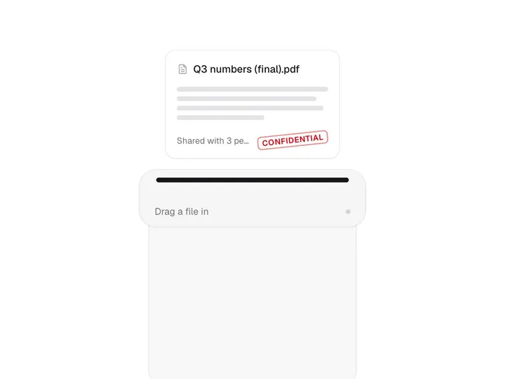
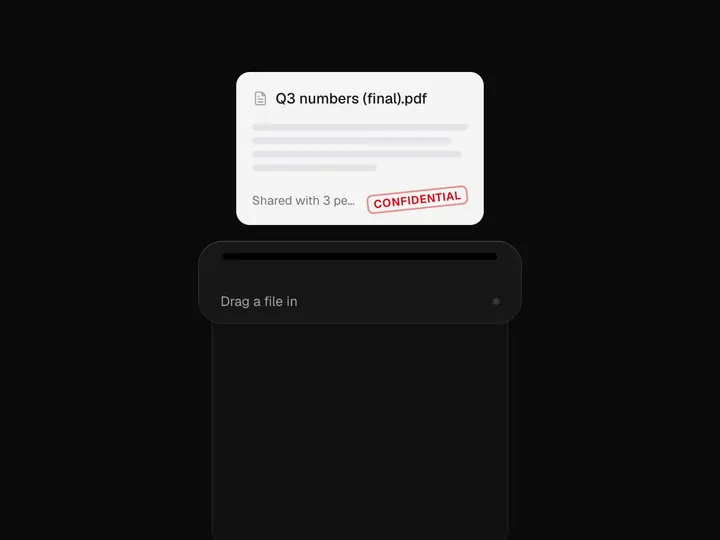
import { LockMelt } from "@/components/uibrik/lock-melt/lock-melt";<LockMelt speed={1} size={56} frost={0.6} relock width={380} defaultLocked label="Unlock" caption="Pro feature" onLockedChange={(locked) => {}} // locked={false}> …</LockMelt>Where to use Lock Melt
Paywalls
Unlocking a Pro feature or report becomes a reward in itself.
Upgrades
The moment a plan upgrade lands, the locked panel melts open.
Reveals
Hidden results, scores or answers revealed with a payoff.
Props
LockMelt- speed
- Type number
- 1
- Playback speed of the melt.
- size
- Type number
- 56
- Width of the padlock's body.
- frost
- Type number
- 0.6
- How strongly the cover blurs the content.
- relock
- Type boolean
- true
- Show a button to lock the content again once it's open.
- width
- Type number
- 380
- Width of the card.
- locked
- Type boolean
- –
- Whether the content is locked (controlled). Pair with onLockedChange.
- defaultLocked
- Type boolean
- true
- Locked at the start when uncontrolled.
- onLockedChange
- Type (locked: boolean) => void
- –
- Called with false once the lock has melted, and true on relock.
- children
- Type ReactNode
- –
- The content behind the lock. Defaults to a sample forecast.
- label
- Type string
- "Unlock"
- Label of the unlock button.
- caption
- Type string
- "Pro feature"
- Text beside the button while locked.
- className
- Type string
- –
- Classes for the card.