Updated
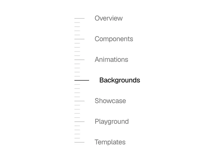
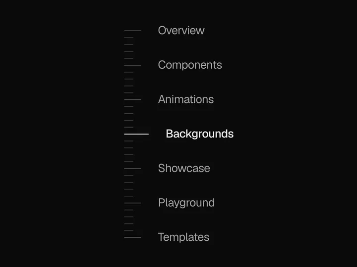
Section Pill
NewCustomize
Bottom
Panel width280px
Max rows7
Offset96px
Installation
npx shadcn@latest add https://uibrik.com/r/section-pill.jsonInstall the packages
npm install @tabler/icons-react motion react-use-measureAdd the cn helper
Imports
cnfrom@/lib/utils, whichshadcn initcreates. Add it by hand without shadcn.Copy the source into your project
components/uibrik/section-pill/section-pill.tsx"use client"; import { IconChevronUp } from "@tabler/icons-react"; import { AnimatePresence, motion, useMotionValue, useReducedMotion, useTransform, type MotionValue } from "motion/react"; import { useEffect, useLayoutEffect, useRef, useState, type KeyboardEvent, type RefObject } from "react"; import useMeasure from "react-use-measure"; import { cn } from "@/lib/utils"; export type PillSection = { id: string; title: string }; export type SectionPillProps = { /** Sections in page order. Each id is the id of an element on the page. */ sections: PillSection[]; /** Scrolling element to follow. Defaults to the window. */ container?: RefObject<HTMLElement | null>; /** Distance from the top of the scroller where a section counts as current. */ offset?: number; /** Which edge the pill sits on. The list opens away from it. */ side?: "bottom" | "top"; /** Width of the open list in px. Narrow screens get less. */ panelWidth?: number; /** Rows shown before the list scrolls. */ maxRows?: number; /** Accessible name for the pill and the list. */
Adds the files to
components/uibrik/section-pill and installs @tabler/icons-react, motion and react-use-measure. With the @uibrik namespace set up: npx shadcn@latest add @uibrik/section-pill.Usage
import { SectionPill } from "@/components/uibrik/section-pill/section-pill";const sections = [ { id: "intro", title: "Introduction" }, { id: "setup", title: "Setup" },];<SectionPill sections={sections} side="bottom" panelWidth={280} maxRows={7} offset={96} label="Sections" container={null}/>Props
SectionPill- side
- Type "bottom" | "top"
- "bottom"
- Edge the pill sits on. The list opens away from it.
- panelWidth
- Type number
- 280
- Width of the open list. Narrow screens get less.
- maxRows
- Type number
- 7
- Rows shown before the list scrolls.
- offset
- Type number
- 96
- Distance from the top of the scroller where a section counts as current.
- label
- Type string
- "Sections"
- Accessible name for the pill and the list.
- sectionsrequired
- Type { id: string; title: string }[]
- –
- Sections in page order. Each id is the id of an element on the page.
- container
- Type RefObject<HTMLElement | null>
- –
- Scrolling element to follow. Defaults to the window.
- className
- Type string
- –
- Classes for the wrapper. Position it yourself, e.g. fixed inset-x-0 bottom-6.